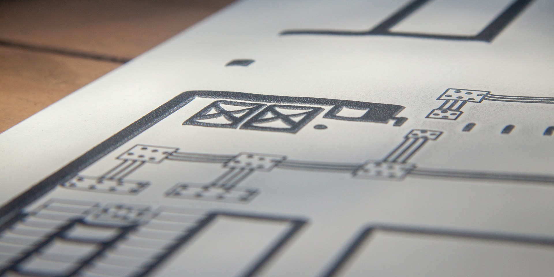
For people with vision impairments, it can be difficult to use conventional maps to understand the layout of a site, especially when the majority of information is communicated through visual graphic design. To help understand the layout of these sites, I developed maps for existing and developing sites using shapes and symbols that are greatly distinct from one another when felt, and utilise dramatic black and white contrast to stand out to those with limited vision. This simplified design language removes any unnecessary features that would be distracting when engaging with touch, and exaggerates scale and proportion to clearly define structure while retaining the layout of the site.
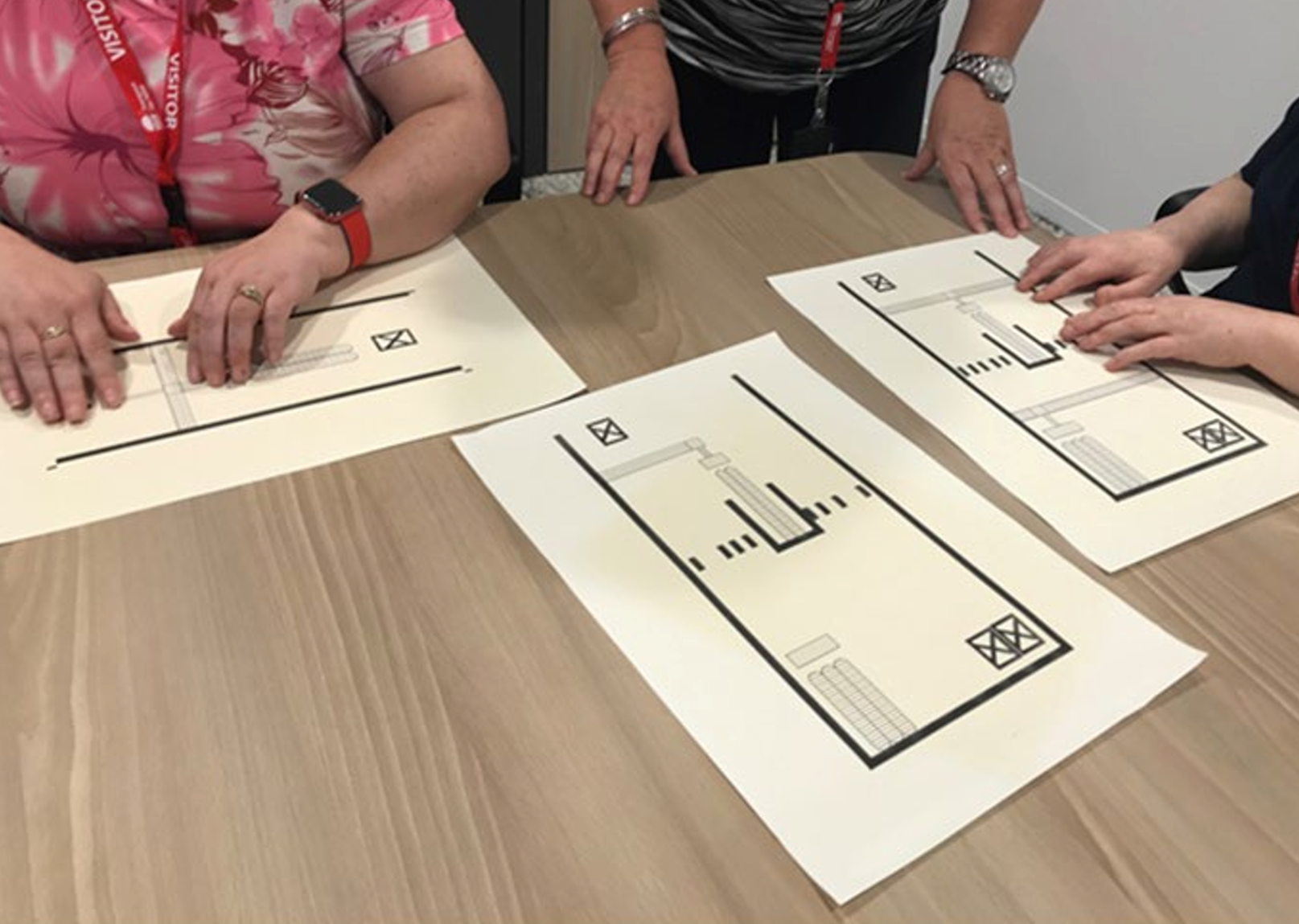
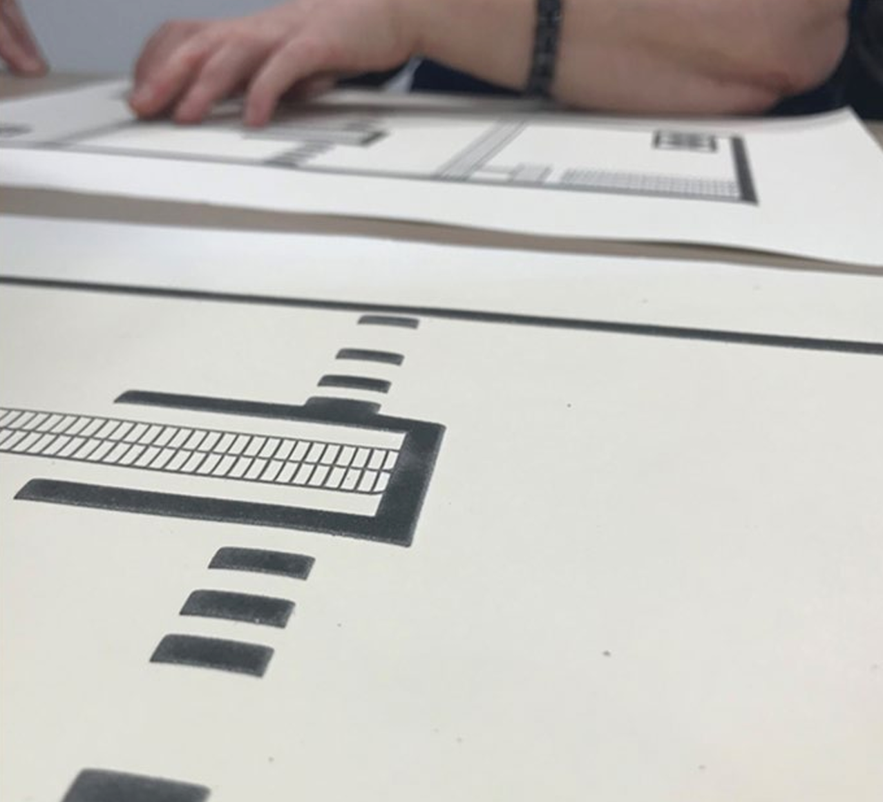
Graphic elements in black are raised to allow for tactile tracing.

The elements are simple but are easily distinguished from one another when felt.
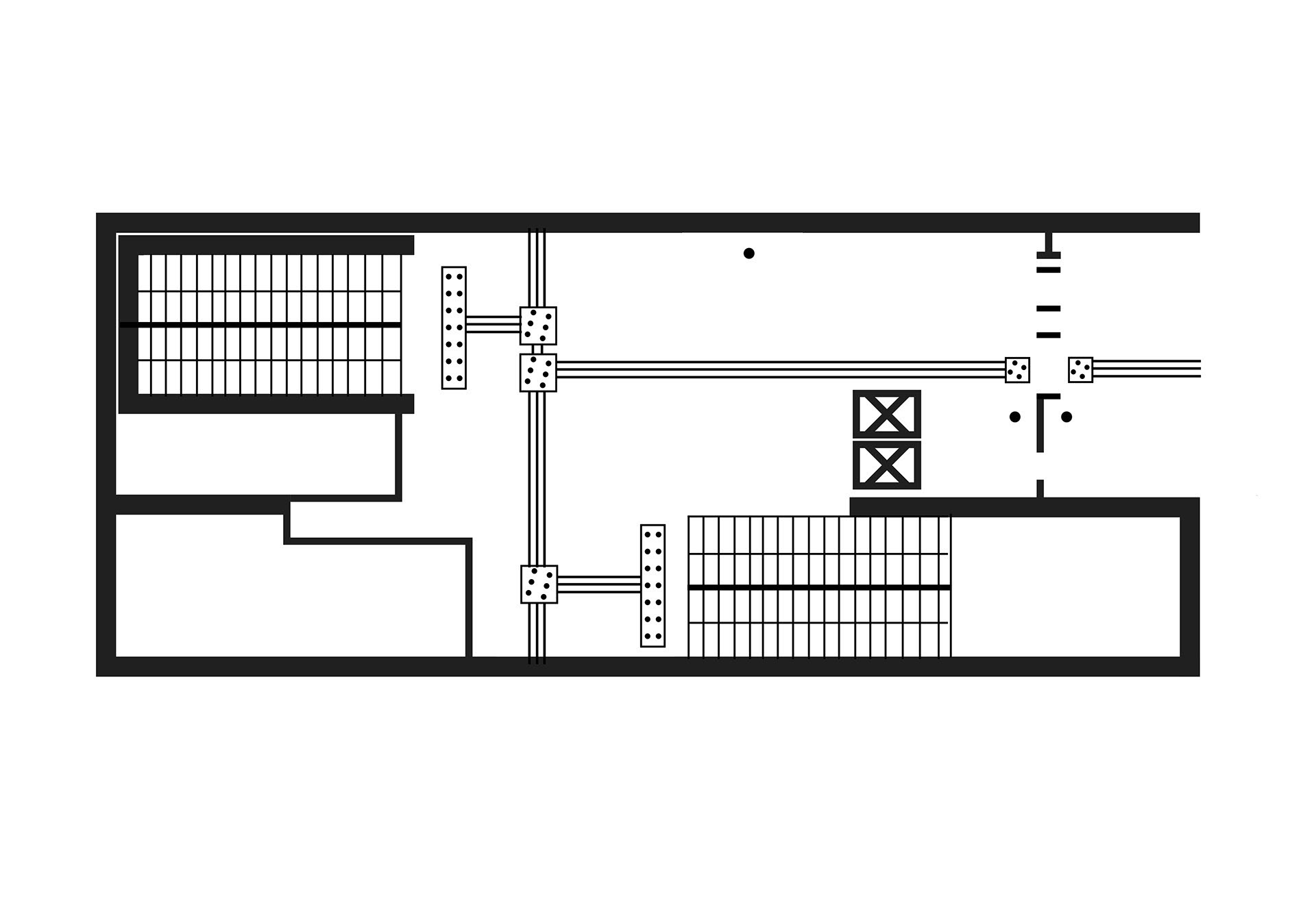
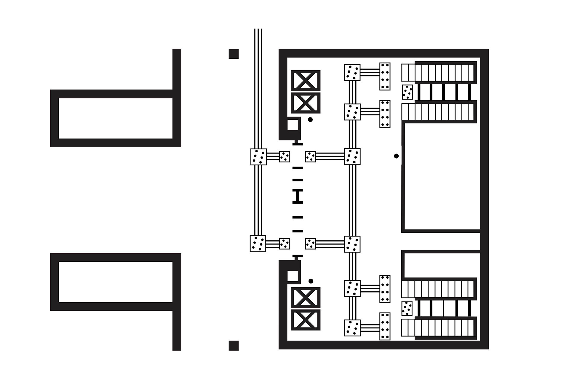
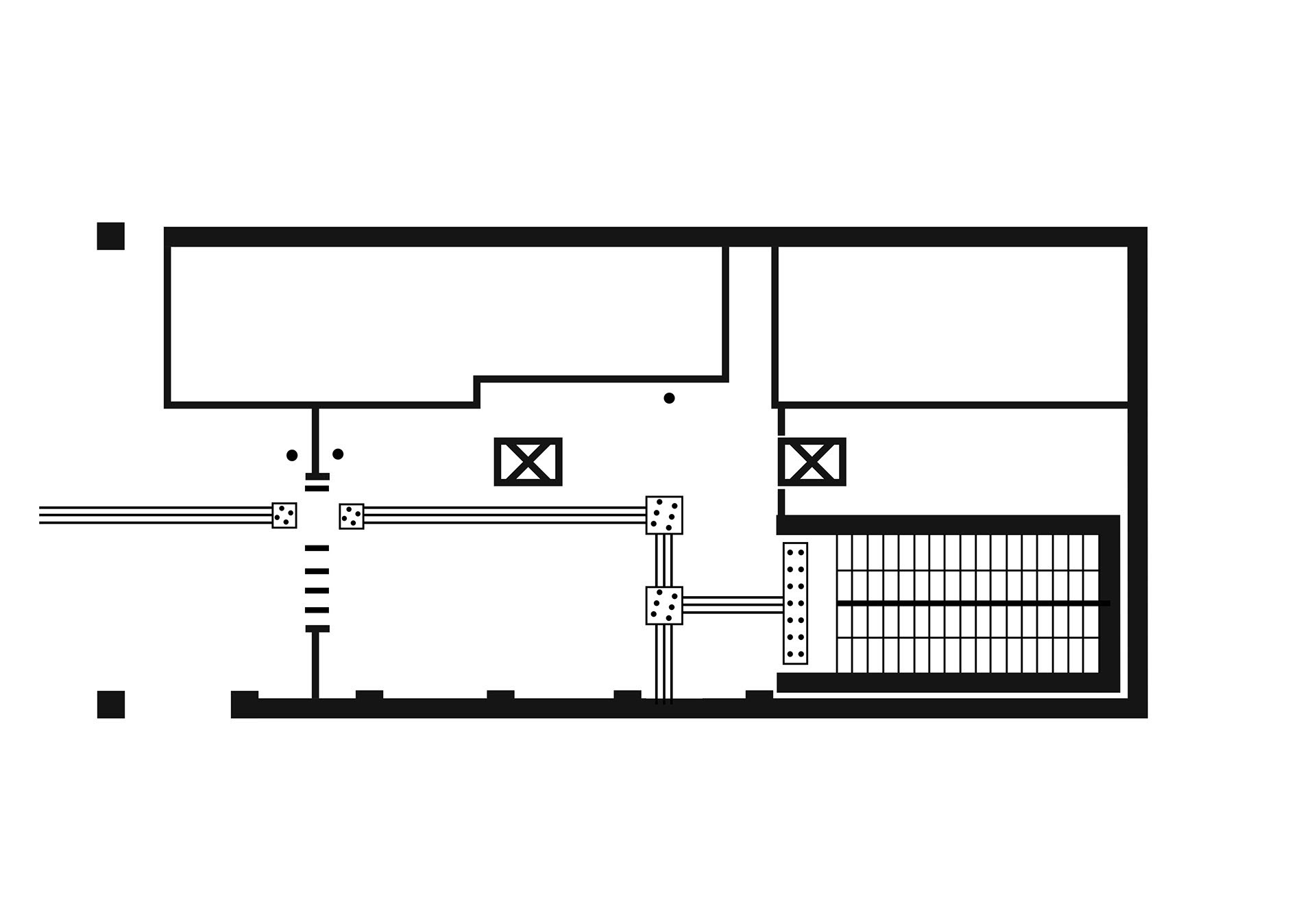
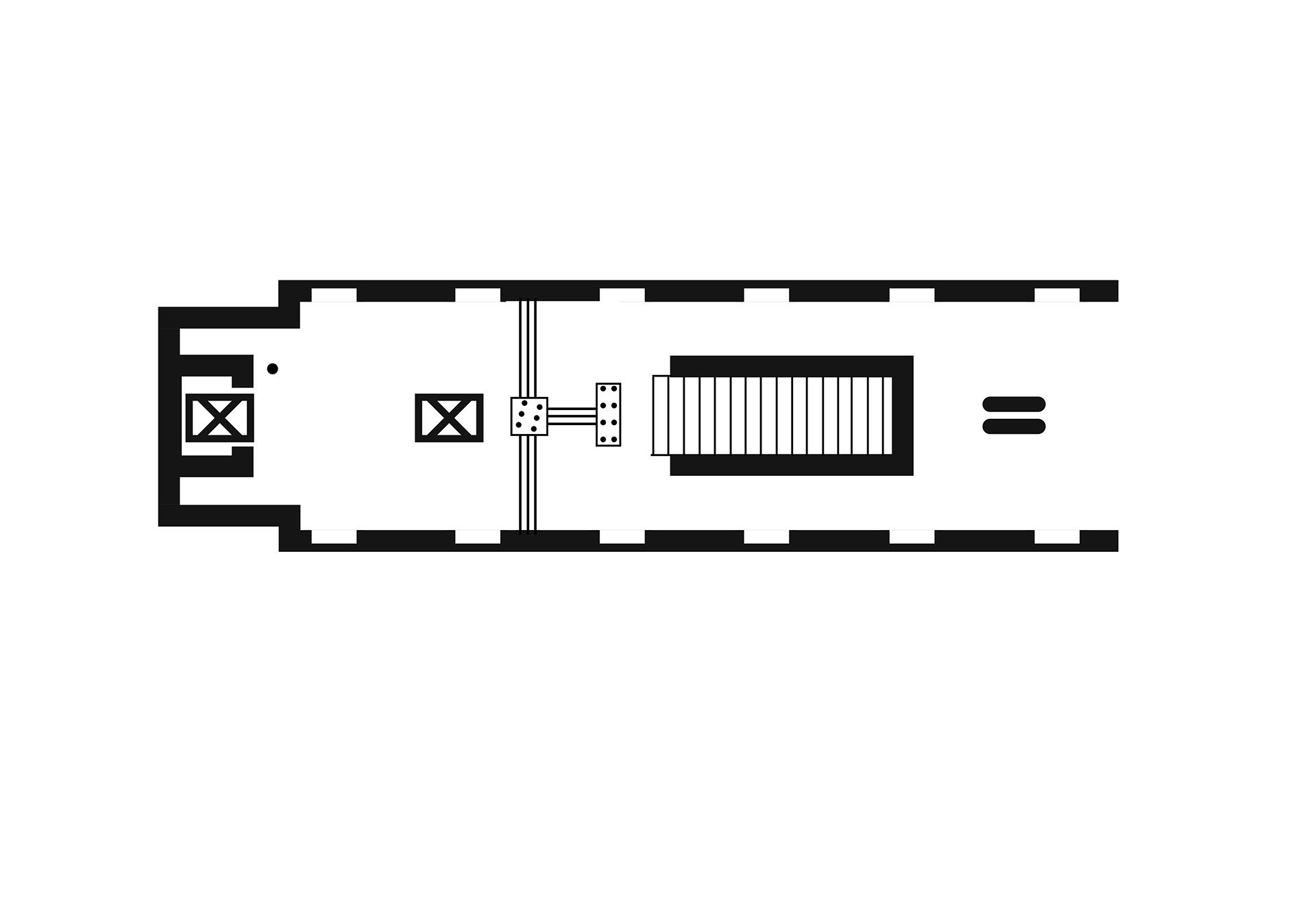
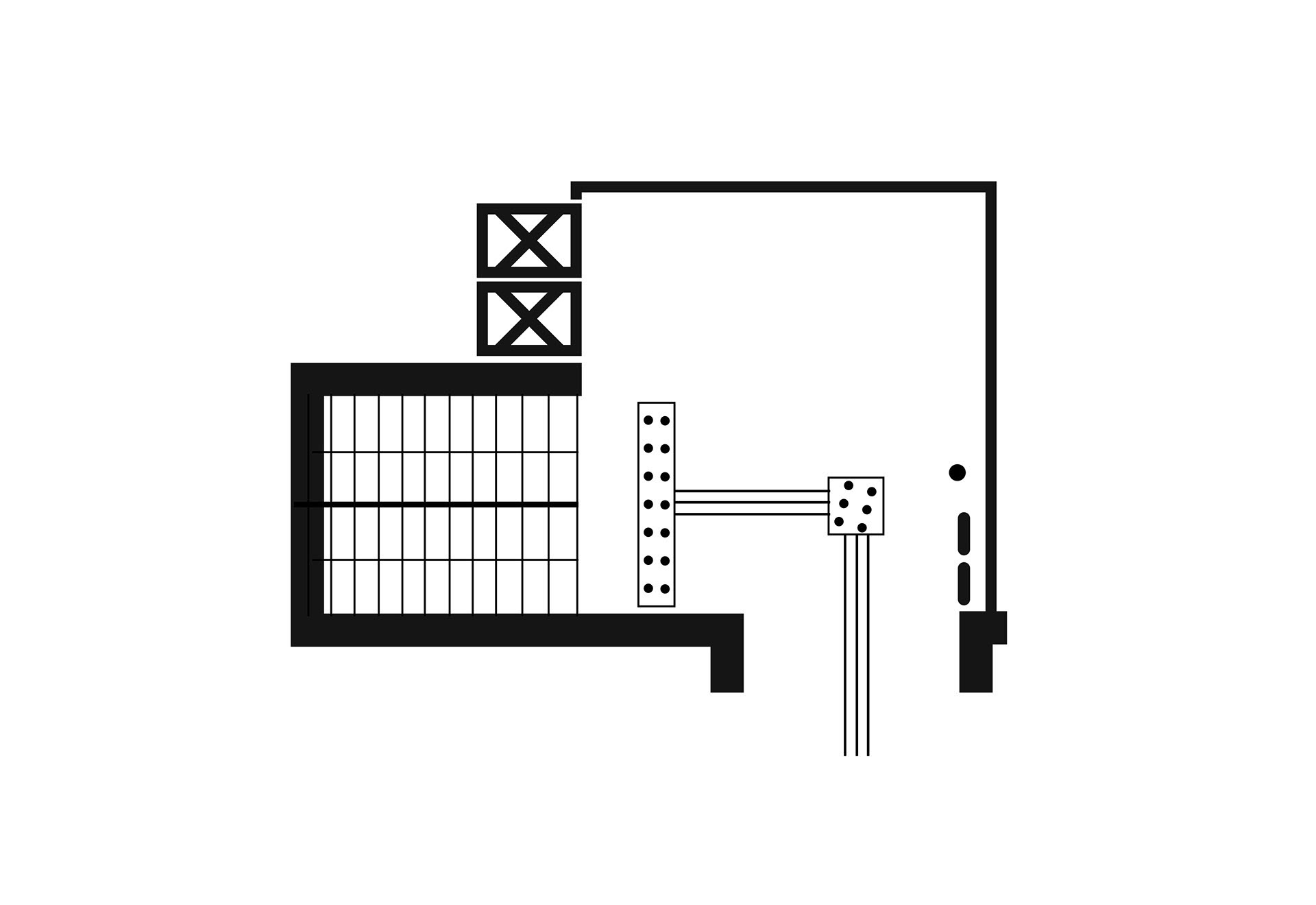
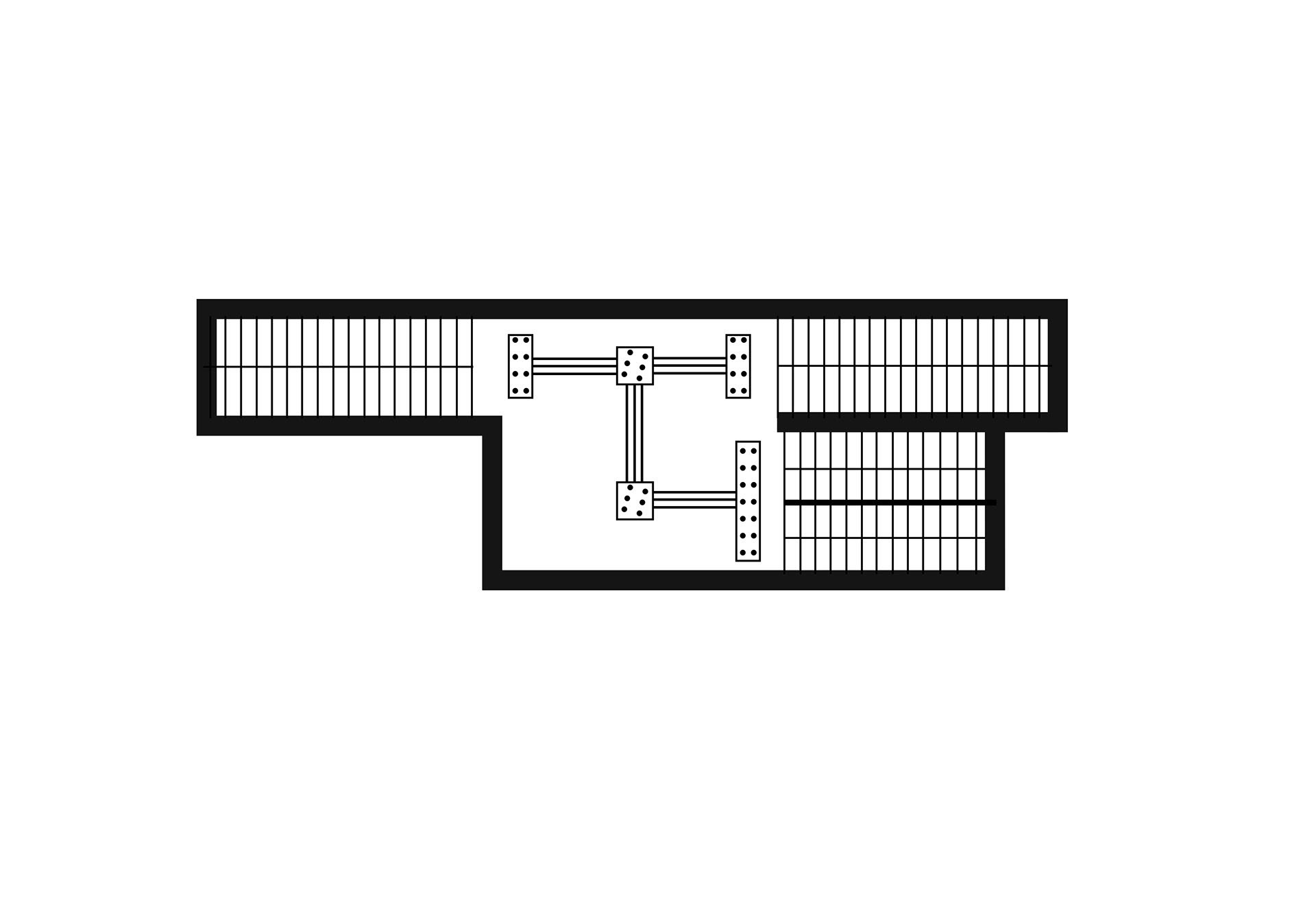
A few examples of the maps.